




Inspire

Shaping the visual language of a metal cladding and roofing specialist.
Inspire is a specialist consultancy working with architects, builders, and designers to deliver premium metal cladding and roofing solutions. They guide clients from the early stages of a project, offering expert advice across a range of high-performance metals including steel, aluminium, zinc, and copper.
The challenge was to design a brand identity that would resonate with industry professionals with a keen eye for detail and reflected Inspire’s professional depth and design fluency while distinguishing it from a field dominated by functional but visually uninspired competitors.
- Branding
- Design

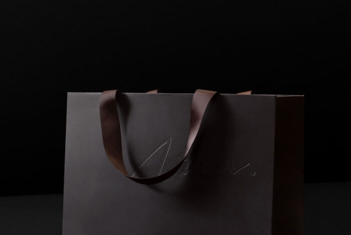
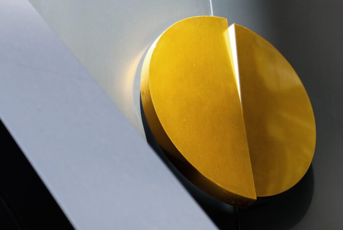
The logotype is entirely hand-drawn, with letterforms designed to subtly echo the curved edges found in folded steel profiles. A refined negative space runs through each character, referencing the architectural language of metal construction and creating a sense of structural balance.
The colour palette was developed to cut through the competitive landscape with a selection of nuanced, earthy tones. This direction avoids the expected reds and blues typical in the category, instead projecting a more sophisticated sensibility aligned with Inspire’s audience.


.
.


To expand the visual system, was developed a signature framing device, inspired by the inner curve of the logotype, and used to hold imagery and highlight content.
Alongside this, a graphic pattern was created, drawing inspiration from the linear repetition of cladding panels. Its dynamic, rhythmic structure adds motion to the brand and evokes the material precision at the heart of Inspire’s offering.
A graphic pattern was created, drawing inspiration from the linear repetition of cladding panels.


The overall visual language is clean and considered, with a technical edge that reflects the precision of the built environment. The colour palette, elegant typography, and high-quality architectural photography work in harmony to create a brand that feels elevated and confident.
To complement the system, a custom suite of icons was developed. Each icon carries a subtle echo of the logo’s inner curve ensuring cohesion across all brand communications and reinforcing Inspire’s identity in even the smallest details.
.

.
.


